VIRTUS: A logo, a name, a mission
When we were asked to rebrand an International Federation and Governing Body for Athletes with an Intellectual Impairment, we weren’t aware we had been pitching against agencies in New York and Australia.
Neither did we know the long history the organisation had of trying to agree what their brand should be – until after we accepted the job!

The original organisation’s name in Dutch, created the acronym INAS.
When the full name was translated into English for global use, the acronym stayed the same.
10 years of struggling to change, streamline and find an outstanding brand
for an outstanding organisation. – that everyone could agree on …
solved by the much shorter named
Blue Strawberry Elephant.
Approach
Our experience of organisations run by committee was mixed.
On the one hand – everyone is always fully on board, with the very best intentions and passion for those they organise, protect, promote and regulate.
On the other, as in this case, there were 80 national
bodies within the Global Federation, 10 representing the rest as a steering / approval body.
Within the management of the organisation, no one believed we would convince every member of the committee to get on board with whatever we created…
Read More
Finding a way around the well-intended but prevaricating friction and disagreements of the previous decade, we suggested we should find common ground they could all agree on.
- Four definitions of what the organisation did for the athletes.
- Four characteristics that described the attitude, dedication and performance of the athletes themselves.
This is what we came up with:
We agreed with the CEO Nick Parr
The Purpose of the Federation
Governs | Advocates | Organises | Promotes
We then suggested the
Characteristics of the Athletes
Integrity | Character | Excellence | CourageWith these agreed we needed a brand that was expressed using 8 elements plus a new all encompassing (and succinct) name.

A 2 x 4 RELAY
of 8 Design Elements to represent the Organisation and the Elite Athletes.
Process
These are not people with a mental disability, whose pastime is athletics.
These are Elite Athletes that happen to have an intellectual impairment.
We felt the pressure of creating something the Athletes themselves could be proud of – a Name they could chant – a Name they could point to and say:
“I am part of this, that is me!”
We never thought the new brand’s aim was just to attract attention, that was actually third on the list…
Read More
In our minds we were going for:
Gold: First on the list was the pride of the stakeholders and athletes wearing the new brand.
Silver: Making the brand as credible and impactful as any other Paralympic organisation (or more credible and more impactful) and only then
Bronze Medal position – greater awareness and interest of the wider public and potential sponsors.
ALSO it had to be:
A brand that could be used in conjunction with the individual brands of national organisations, with regional and Global competition brands and alongside the logos of the Paralympic movement – without being eclipsed or seen as subservient to any.
A Laugh
A Minute >
EIGHT ELEMENTS
became the “Zebra Mane”
What we did
Presenting the idea to the International Committee of 10 by Video Call, in all their time zones was a one off opportunity. We didn’t have multiple Logos or Names to show them – it was just a single Brand Concept with masses of relevant variations:
The Zebra Mane and it’s Elements.
The Name that came from a BSE Studio Brainstorm.
The Custom Logo Font with banner.
The Integrated Logo that brought everything together.
Lock Logo Examples to show how well it would work with partners, regional / global events and sponsors and
80 different colour ways to match each nations sporting colours.
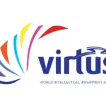
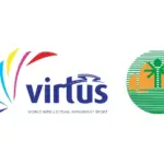
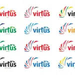
One Concept to Please Them All – One Logo to Bind Them!
Plus variations, Lock Logos and National Colours.
Outcome
The outcome was unique hand drawn design elements digitised to integrate with a customised font to create the Logo – launched at the Global Games in Brisbane, Australia, 2019.
A Logo so strong it has become the supporting structure for the 40th Anniversary and the wings of the World Intellectual Disability Day Logo.

(Or just the 80 countries – if you want to be pedantic).